Ever since I first started working on the Namaqualand blanket pattern, I have wanted to know what it would look like in Colour Crafter Velvet. I didn’t have the time to make another one myself, and I didn’t feel bold enough to ask anyone to do it for me. I could have asked side-kick Jenny, but she has been busy making a gorgeous Sophie in Whirl (I’ll tell you about that one of these days), and I didn’t want to distract her from that. I finally decided that I wouldn’t know what it would look like if I didn’t ask someone, so I asked my friend Pat, who is one of the most meticulous crocheters I know. She said yes with an enthusiasm that made me sorry I hadn’t asked her ages ago. This blanket is the gorgeous result. Thank you, Pat!
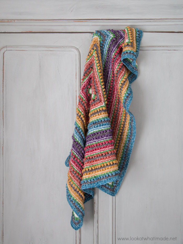
This colourway is more Autumnal than the original colourway, but I like the fact that it is. Where the original felt fresh and summery, this one feels rich and jewel-like.
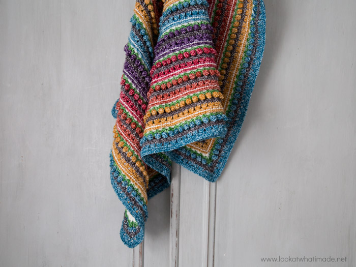
I was pleasantly surprised by just how squishy this blanket turned out. I’ve worked with a lot of acrylics before, but I have never had a project that ended up feeling quite this yummy worked up.
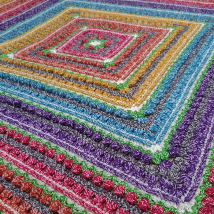
Namaqualand Blanket in Colour Crafter Velvet
“This blanket was inspired by the beautiful colours of the Namaqualand flowers. It was specifically designed for the Be Inspired South African Tour 2016. It is made up of a simple 6-round repeat. The pattern literally contains every lesson I have learned since starting to crochet, so if the first 6 rounds seem daunting in their wordiness, please don’t be disheartened. Once I have told you (in those first 6 rounds) everything I would like you to learn or take away from this pattern, the rest of the repeats become much easier. Think of this pattern as a workshop-by-proxy (and bring tea and snacks)!”
– taken from the Namaqualand Blanket Pattern
Materials
- 4 mm crochet hook (US 6/G UK 8)
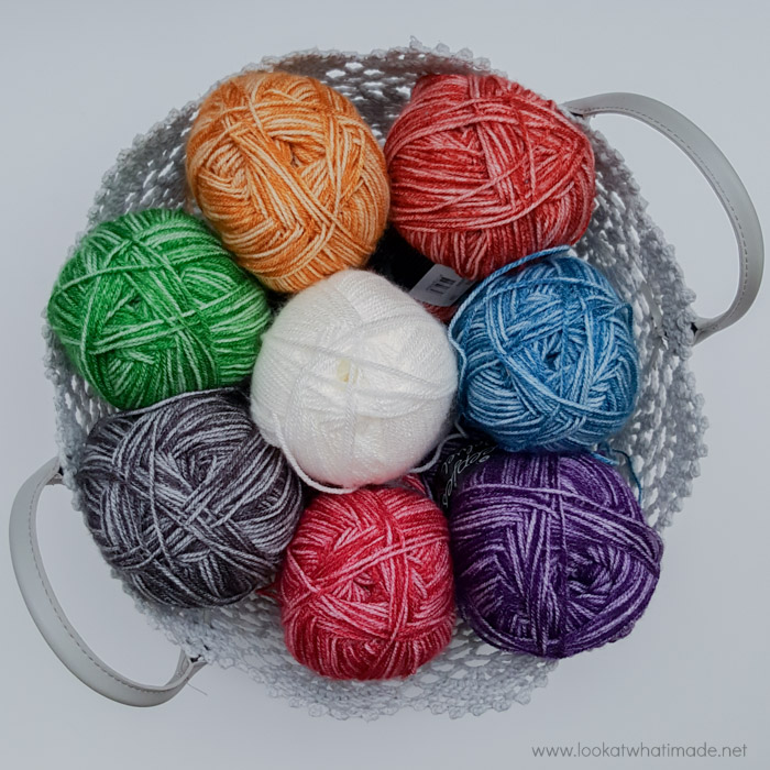
- Scheepjes Colour Crafter (100% Acrylic, 300m/100g):
- 2 balls of Barneveld (1005)
- Scheepjes Colour Crafter Velvet (100% Acrylic, 300m/100g):
- 1 ball of Turner (854)
- 1 ball of Bogart (847)
- 1 ball of Garland (852)
- 2 balls of Astaire (845)
- 2 balls of Taylor (842)
- 1 ball of Burton (859)
- 2 balls of Bergman (849)
For a full list of yardages and colours per round, please see this spreadsheet.
Colour Packs are available in my Wool Warehouse Shop HERE and include a printed written-only version of the pattern. You can also buy yarn packs from Deramores HERE. If you live in South Africa, you will soon be able to buy yarn packs from Be Inspired. For a full list of Scheepjes stockists, visit Scheepjes (NL).
Gauge
If you are using the yarn packs (or the suggested yarn amounts), it is important that you try to match the gauge suggested below. Otherwise, you might run out of yarn. The colour packs contain an extra skein of Garland (852) to ensure that minor changes in gauge don’t leave you short. If you are buying the yarns separately, I suggest buying an extra skein of Garland if you want to make sure that you don’t run out of yarn.
At the end of Round 6, your square should measure 14 cm (5.5″). At the end of Round 12, your square should measure 26 cm (10.25″). Each subsequent 6-round repeat will add 6 cm (2.35″) to each side.
Size
If you use the yarn packs (available HERE) or the suggested amounts, the blanket will be 1.1 m x 1.1 m (43″ x 43″), but you can continue to add 6-round repeats until it is as big as you want it to be. You will need to buy more yarn if you do decide to go bigger.
Pattern
You can find the pattern for the Namaqualand blanket HERE. It contains step by step photos and a diagram, making it suitable for adventurous beginners.
Notes
If you are going to make the Colour Crafter Velvet version, please remember the following things:
- Gauge will be different to the one specified in the tutorial (see Checking Gauge above).
- Size will be different (see Size above).
- Yarn will be different (see Materials above).
- Colours per round will be different (see THIS SPREADSHEET).
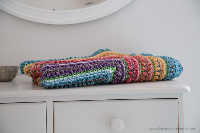
I couldn’t resist sharing just one more photo with you. When I attended Blogtacular, I had the privilege of meeting Lucy from Capture By Lucy. I bought three of her gorgeous backdrops. The one below is Meadow, which I used for the first time to take this photo.
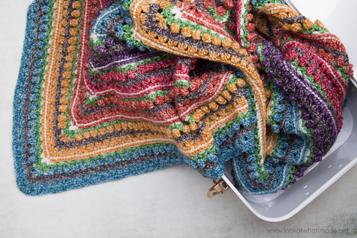
I’ve decided that I must have a thing for scrunched up blankets because this photo is my favourite of the bunch, just like the scrunched up photo of Charlotte’s Dream was my favourite of that bunch (you can see it below). I’m curious to know which photos most appeal to you. Do you like images where you can see the entire blanket laid out flat and unstyled (Sophie’s Universe below), or do you like messy photos? Let me rephrase that question because obviously we ‘like’ to see the whole blanket so that we know what we are aiming for, but that is not what I am asking.
I want to know which photos you are more likely to click on/save/pin/drool over! When I look at a flat photo, I think “Wow!” but that is all I think. Well, maybe I think “I wish I had designed that!” When I look at a ‘messy’ photo, I don’t just see a photo; I see a whole story. I see myself cuddling under the blanket with a good book (Wild by Cheryl Strayed this week) while the rain pelts away at the windows as it is currently doing. I can imagine myself pushing the blanket aside when I get up from the couch to refill my now-cold coffee, pausing for a second at the bottom of the stairs to listen out for fights from the two boys playing above. I can feel the pleasure of sliding back under the blanket and pulling it back over me (and the boy napping next to me). I can lose myself in the imagined peace of the scene, so I don’t just ‘like’, I ‘love’!
*Shakes myself and comes back to earth*
Anyway, I would like to know your thoughts on the subject.
If you decide to make this blanket, and share photos of your work, please use hashtags #namaqualandblanket so that I can see your pictures :)

This blog post contains affiliate links. I only link to products I personally use or would use. All opinions are my own.


Trish W says
To answer your question about photography preference, I want to always see the *entire* finished blanket hung or laid out flat, in order to study the overall design & color effects. The “scrunched up” arty shots are helpful in revealing the drape of the fabric (presuming it’s been washed first to get rid of any factory sizing added to the yarn). So both views are helpful :-) but seeing the *entire* blanket is really the most informative by far. Seeing only “scrunched up”, extremely angled, or partial shots is frustrating — I’m not likely to attempt any pattern when I can’t see the whole finished blanket.
The Namaqualand blanket is a beauty worked in the Scheepjes Colour Crafter Velvet — great choice.
Dedri Uys says
Thank you for your insightful input, Trish :)
Jane says
I love the scrunched up look of charlottes dream, which I am getting up the courage to make next on my list :) love your colour choices, they do look like jewels
Dedri Uys says
Thank you :)
Nancy says
Just beautiful! I will have to find my “conversion” chart to make sure I get the “inches” correct, but I can’t wait to do this one! Thank you so much!
PS – I love the “messy” pictures! :D
Judy says
Did you choose the colors, Dedri, or did Pat? I’m just wondering who had the vision, for in the basket, the colors are nice but not extraordinary. But in the blanket, as you said, they are rich and jewel-like and work beautifully together. Choosing coordinating colors is the hardest thing for me, so I’m always curious to learn how others do it. Maybe you can do a color post some day to describe your tips and techniques for choosing colors. In the meantime, thank you for sharing. Lovely work, Pat!!
Dedri Uys says
Hi Judy.
I chose the colours. When I made the Namaqualand in Stonewashed, I found it easier to ‘predict’ that the colours would work well together, but even so, the first 3 repeats (red, orange, yellow) had me doubting myself and it wasn’t until the blue came in that I knew it would work the way I wanted it to.
If I hadn’t gone through that process with the original Namaqualand, I would never have thought of putting these Colour Crafter Colours together. The shades are slightly different and you are right; if you just look at the balls of yarn, they don’t look as nice as they do worked up. When Pat had finished the first 3 repeats of this version, we had the same ‘ooh, will this work’ moment, but just as with the original version, the minute the blue came in it livened right up.
I know there is science behind choosing colours, but I just choose the colours that I think will suit the mood and story of the blanket. I get it wrong as often as I get it right (although, of course, what I see as right, someone else could see as very wrong!).