Scheepjes have released a brand new 100% recycled yarn. It’s called Terrazzo, and it is absolutely gorgeous. Last week, I shared the Diversion Scarf I designed using this yarn. This week, I’d like to tell you a little bit more about the yarn.
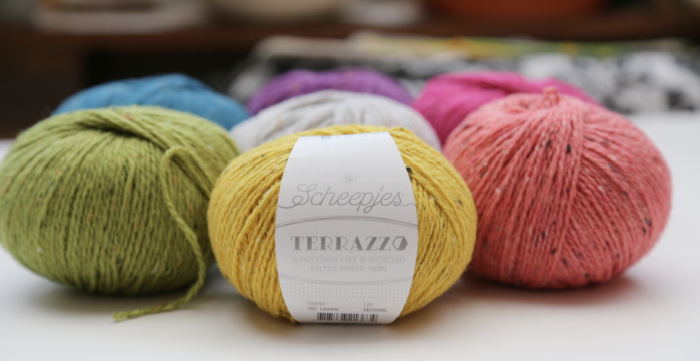
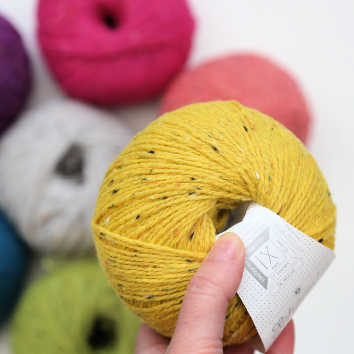
Terrazzo is made up of 70% Recycled Mulesing Free Wool and 30% Recycled Viscose. There are 50g to each ball, with a yardage of 175m per ball. Being a DK weight yarn, the recommended hook/needle size is 4mm.
Terrazzo is available from Scheepjes Stockists HERE. You can see Matt Farci’s review video for the yarn HERE.
Terrazzo is a 2-ply with a nice twist. When I used it with the long-tail cast-on method to knit with, it didn’t untwist itself, which was a nice little surprise. I’ve managed to ‘untwist’ a fair bit of yarn by using that method in the past. Or maybe that’s just me and my lack of knitting know-how.
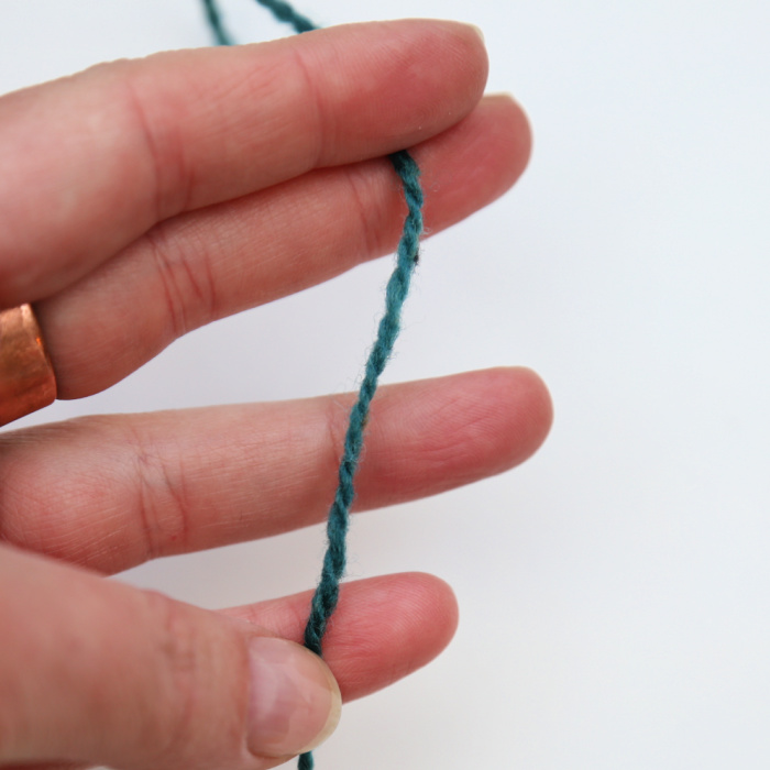
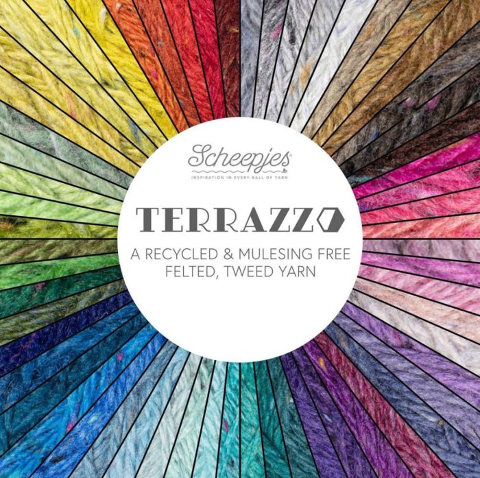
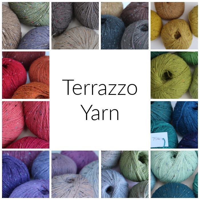
It is available in 60 shades, ranging from muted…
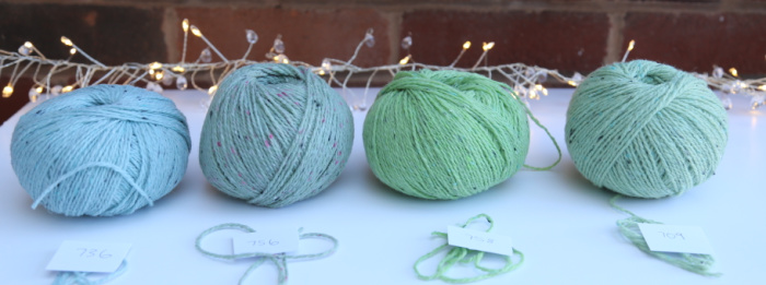
… to bright and cheerful.
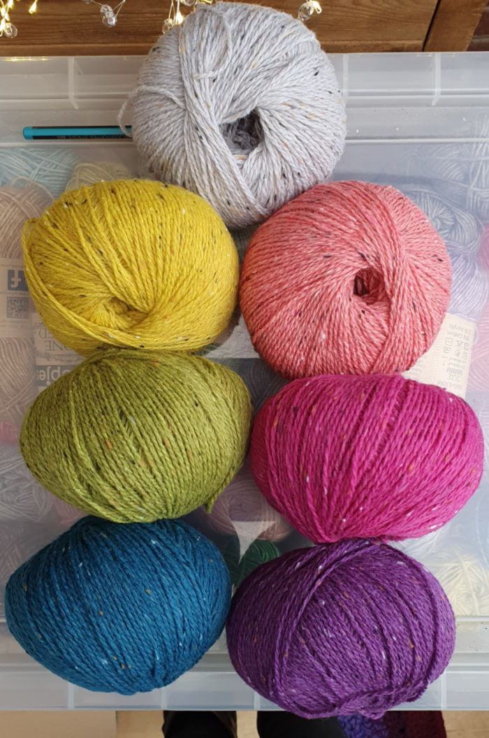
Here’s a little taster of all 60 shades…
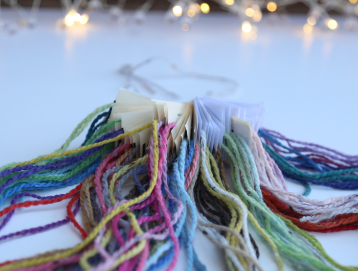
…and a photo of my haphazard attempt at organising all the shades for my ‘yarn stash library’.
The yarn is so lovely to work with (both when knitting and crocheting – and ooooh, Tunisian would be soooo good… where is my notebook…), and it has a gorgeous drape. It is surprisingly soft, given the wool content, and the little flecks running through it gives it a very elegant look when worked up.
Doesn’t it just scream: “GARMENT!”? It does to me 😊 So much so that I am tentatively trying to make myself a jumper. We will see how that goes 😊
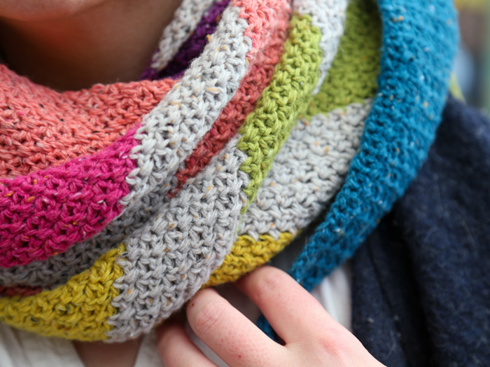
The flecks in the yarn are not all the same colour, which I LOVE. In the bold colours I chose for my Diversion Scarf, all of the colours have black, white, and orange flecks, with the exception being the Coral (which has black, white, and dark pink flecks).
This subtle effect is like a visual leitmotif running through the finished project, making it feel more cohesive.
It also prompts me to use colour combinations that may fall outside of my comfort zone. For instance, I wouldn’t normally marry rich purple and pale blue if I had to choose only two colours.
BUT…
The light blue flecks in this purple (720 – Sangria) are gorgeous, and I can imagine it working really well with one of the light blues… maybe 738 (Lago), which has flecks of pink running through it.
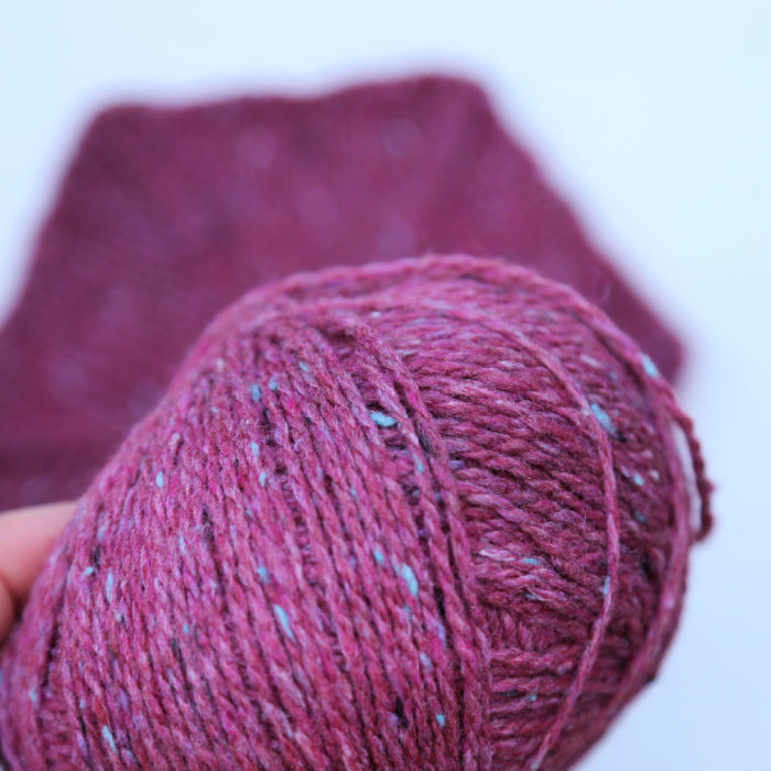
I used this purple to knit a little hexagon – Yes, I knit(ish)!
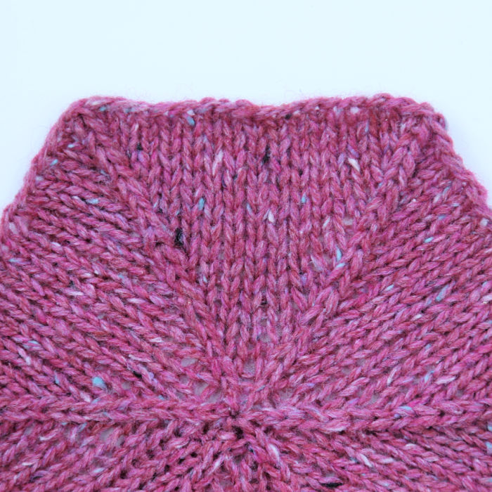
How lovely is that stitch definition? The yarn glides really well, and I didn’t split it even once! So that’s another bonus.
Terrazzo works great with simple stitches. Just a little dot of contrasting colour here and there to tease your eye…
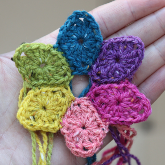
… but for me, it really shines when used in conjunction with textured stitches!
I used 706 (Paglia) to work up a little textured swatch with the stitch I used for my Ammonite Wrist Warmers (which would look AMAZING in this yarn – especially in grey 742 with its pink flecks).
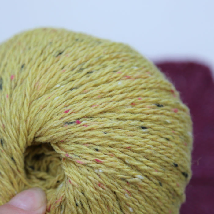
From the photo below, it probably looks as if the texture gets lost in the ‘dappledness’ of the fabric…
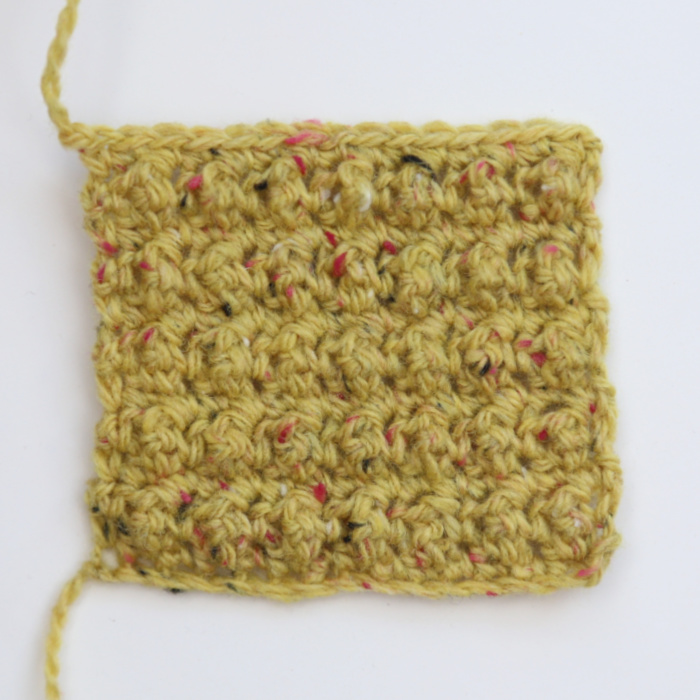
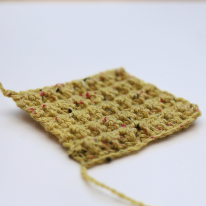
… but in fact, the texture is very much alive. The beauty is in the movement and everyday real-life use of whatever you are making with the yarn. Here is the same swatch photographed at an angle.
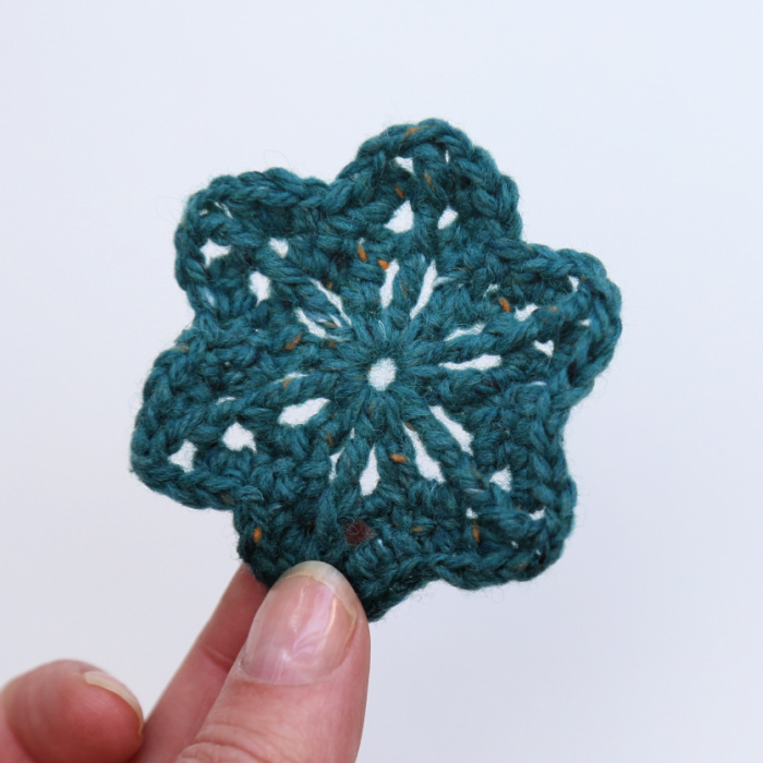
I worked up a quick little motif too, just because I couldn’t resist this specific shade of teal/petrol (especially with the burnt orange flecks – my two favourite colours to wear) and wanted to see what the scribbled pattern in last year’s journal actually was.
I have also used my ‘playing with new yarn’ time to square up the Six Degrees of Separation Coaster. I’ve been meaning to turn it into a square for ages, and I’m so pleased that this yarn (and a request from a friend) gave me the kick I needed to finally sit down and do it.
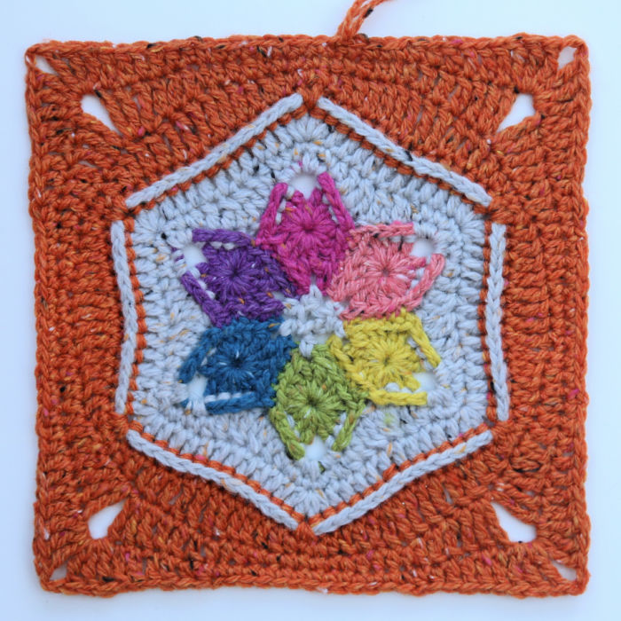
I couldn’t resist adding the burnt orange (715 – Mandarino) to the colours I had left over from the Diversion Scarf. And just to refer back to what I said earlier about the aliveness of the yarn, can you see the little pink and yellow flecks?
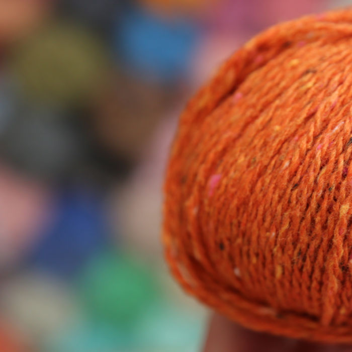
I just spent 10 minutes trying to make sure that I’d referenced the right shade, but viewing the ball in the light of our dining room and living room, I couldn’t see any pink flecks. I was sure I’d made a mistake. All I could see was white and black flecks. And then I walked into the kitchen with its fluorescent light, and ‘POP’ went the pink and yellow. I made Christiaan look at it too, just to make sure I wasn’t seeing things. It’s like magic! I LOVE the chameleon nature of this yarn so very much!
Next week I will be sharing a pattern for some wrist-warmers I designed using the leftovers from the Diversion Scarf. Until then, have fun!
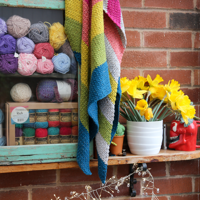
Ps. Terrazzo will be available in a Colour Pack soon (60 x 10g balls). I cannot wait. You’d be surprised how far 10g of this yarn goes!

This blog post contains affiliate links. I only link to products I personally use or would use. All opinions are my own.


